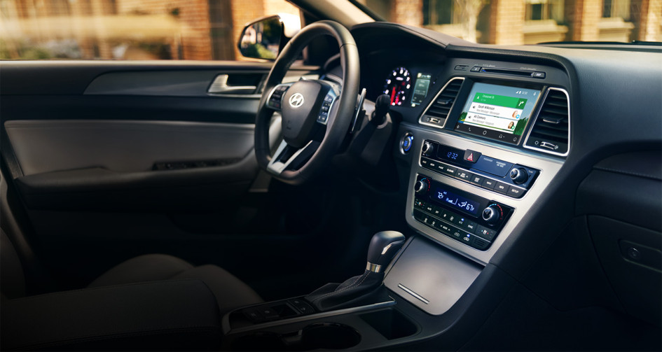
In an age where touchscreens dominate car interiors, Hyundai is embracing a classic approach: old-school buttons. New research from Hyundai suggests that many drivers still prefer physical controls for commonly used functions—a surprising revelation for some, but perhaps not so much for drivers tired of swiping through screens.
At Hyundai’s North America design studio in California, Korea JoongAng Daily uncovered the details behind Hyundai’s choice to hold onto switchgear. Ha Hak-soo, Vice President at Hyundai Design North America, explained that the brand initially admired Tesla’s bold move to go all-digital. However, feedback showed that cramming everything onto a screen wasn’t as user-friendly as it appeared.
“We realized that people get stressed, annoyed, and steamed when they want to control something quickly but have to navigate through a screen,” Ha Hak-soo said, underscoring the frustration drivers face when using touchscreen-based controls in high-pressure moments on the road.
Hyundai’s commitment to physical buttons is more than a nostalgia trip. It’s grounded in the practical advantages of “muscle memory,” allowing drivers to quickly locate buttons and knobs without taking their eyes off the road. Studies show that oversized displays can be distracting, and Hyundai’s Head of Global Design, Sang Yup Lee, agrees: “When you’re driving, it’s hard to control it [the touchscreen]. With hard keys, it’s easier to sense and feel.”
The brand’s decision also contrasts with Tesla, which not only embeds nearly all functions into its display but has even eliminated physical gear shifters, integrating them into the screen—a feature that has faced mixed reactions.
Hyundai’s research affirms that drivers want accessible, tactile controls, a sentiment that would likely resonate worldwide. While touchscreens remain valuable for certain functions, a hybrid approach with strategically placed physical buttons may be the key to keeping drivers happy—and safe.


